The colors in the films of David Lynch
David Lynch uses almost the same color palette in most of his movies. For example, other producers and directors are mostly focused on selection of scenery, costumes, and actors. As Tim Burton is all built on the fabulous gothic scenery, Lynch screenplay is all around the colors.
Although every director’s film has his own set of certain colors, you can still highlight a single pattern — a combination of red and blue.
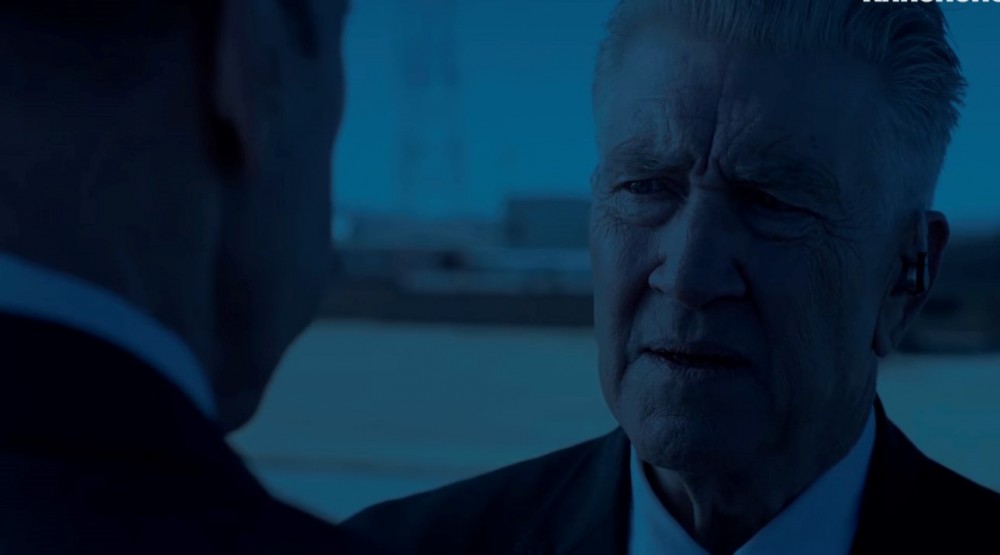
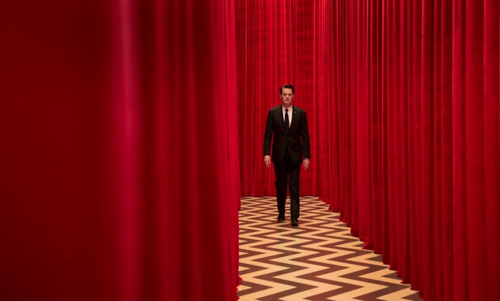
Let's look at the footage from the series «Twin Peaks» 2017


Such a set in Lynch films is of particular importance. For example, red often symbolizes danger or deceit, and blue is a mystery, a mystery that the main hero has to solve. Blue is a symbol of uncertainty.
Despite the limited color set, this color contrast creates a recognizable style of the director. In some moments, such colors seem exaggerated, ostentatious and even base, but in the vast majority of cases red and blue help create a gloomy atmosphere, by means of colors contrast.
In some cases, Lynch uses warm tones, but only to emphasize dark blue or azure objects, since blue refers to a mystery to be solved. In the «Twin Peaks”, series red and blue are used to highlight the transition between the worlds.

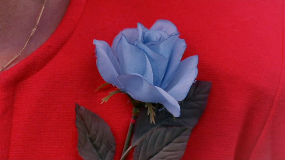
In Lynch's works, red is usually complementary to blue. For example – pale blue rose on a background of scarlet cloth, firefighters and police cars blinkers, etc. Moreover, a gloomy and rather ominous red curtain that repeatedly appeared in the director's films.
These two colors contrast conceals some insanity or depravity of heroes behind itself, and is often the key for the spectator.