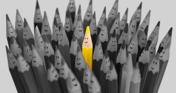
Color isolation
Effect Restorff or «isolation effect» – psychological principle, the essence of which is that the marked object, such as a red cover book on a shelf with green ones, is more likely to be remembered by others. This feature of human memory is often used by creators of computer games, marketers and designers, artists, photographers and film directors. The main markers are the size, shape and of course colour. So the students took to the habit of marking important lines in textbooks with a marker, because the information that stands out from the rest of the homogeneous text is memorized much better. This effect can seriously affect conversion.
The effect is named in honor of Hedwig Restorff German psychiatrist, who experimentally discovered it in 1933. The participants presented a list of words in which one was different a different color. As a result, the selected word remembered most.
Video with more detailed analysis of this effect: https://www.youtube.com/watch?v=Z0EIUtFrtp4
Thus, the study “Aesthetic response to color combinations: preference, harmony, and similarity” showed that although the overwhelming majority of consumers prefer similar shades, but them express much sympathy for contrasting palettes with bright color accents.
Another proof of the effective application of the insulation effect are the tests with color-changing buttons. They showed that after changing the button color from green to red, the conversion increased by 21%. Obviously, most of the page is focused on the green palette. This means that the green call to action just merges with the background. Red is a complementary color to green and it provides a sharp visual contrast.

How to use isolation effect in marketing?
● Create useful, meaningful contrast between the promoted product and the cheaper(less quality) counterparts. Surely you have noticed this technique in advertising, when the bright packaging of the same product compare with faded, discolored, “not named” packaging of another product;
● Bright packaging of a fancy shape — something that will highlight your product on the shelf with the same type of competitors. The more nonstandard the product packaging design is, the more likely customers are to pay attention to it.
The effect of isolation in the design
● In the process of developing a site design, highlight the brightly useful buttons that should immediately be noticeable to the visitor, such as “subscribe”, “enter” or “register”
● Change the type of visual effects. For example, if most of the images — the pictures, the contrast is to add a few illustrations, videos, etc.;
● Vary the background color. This is a simple way to emphasize your main ideas;
Don't know what color to choose? Choose a color that will be in harmony with the site! This will help you apps like Color Assist, Live Palettes.