Jaded color schemes in modern cinema
The role of color in the movie is very important. With help of color, filmmaker increase the intensity of emotions, accent the importance of the episode, show the details, and create the necessary atmosphere.
“Like Wes Anderson,” “Retro Cinema,” “Blue and Yellow,” many viewers have already remembered these color schemes.
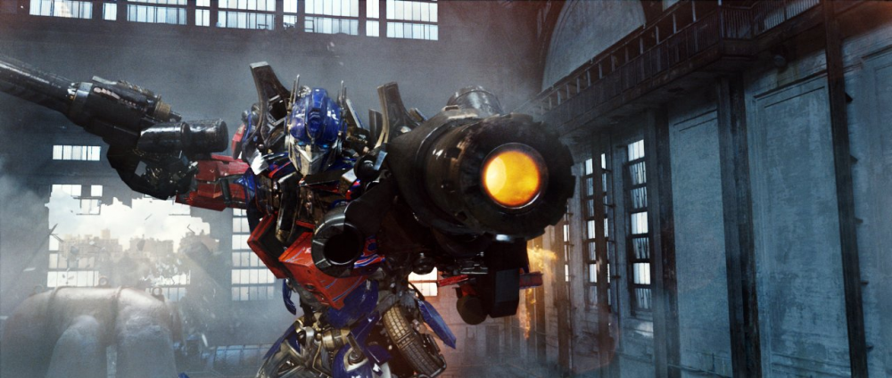
Michael Bay's favorite palette.
Yellow and blue — perhaps the most common combination in modern cinema. No matter how much we are tired of the borderless “Transformers” and “Avengers”, the choice of such a palette is primarily due to the color contrast — this is a very successful pair. Almost in each episode, we can observe actors whose complexion is as close as possible to pastel, yellow and orange colors. Based on the color contrast the opposite pair is blue or light blue — so the background or environment is usually painted in these colors.
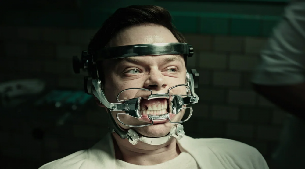
Horror in cold tones.
Cold, too blue or green colors do not give rest to the creators of thrillers and horror films. In fact, these are standard colors for these movie genres. Such palette is close to our perception of color at night, in fact, the story of most of these movies happens at night.
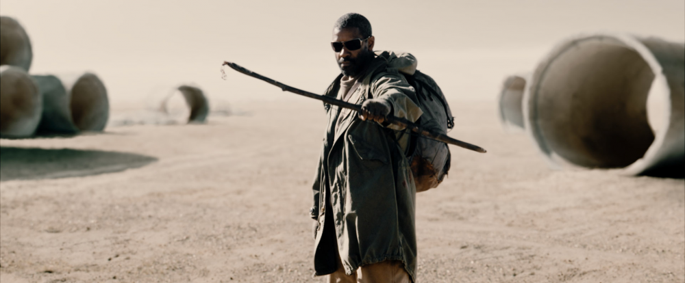
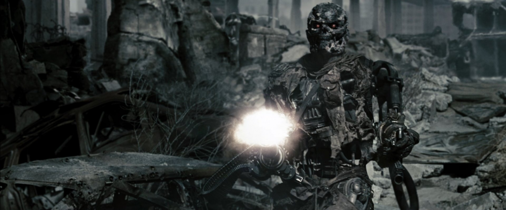
Discoloured apocalypse.
Gray, blurred, discolored – description of the color palette of most apocalyptic and post-apocalyptic movies.
Even when the action take place in the desert, the sand around for some reason is not yellow (as, for example, in “Mad Max”), but certainly gray, as if only dust and cement are around. This color cliche is so deeply rooted that sometimes scenes with rich vegetation look almost like b/w.
Interesting video: https://www.youtube.com/watch?time_continue=91&v=0ZZgiSUyPDY
As we can see, the color palette in the movie work for different aims. However, in most cases, the choice of palette depends entirely on the vision of the film director, colorists and editors.